
Plan With Me --- September 2017
Sunday, September 17, 2017
Hey everyone, I hope you are all doing well and enjoying the change of seasons. Here in Idaho, there's lots of beautiful Fall color going on:

Here are my page spreads for September. I hope you enjoy them. I will include appropriate links for any items and/or products I used on my spreads (or any borrowed ideas I incorporated). I always try to give credit to others who have inspired me.

First up is my September calendar, and in place of a habit tracker, I decided just to leave a space to write some things I accomplished this month. I thought it might be more encouraging to actually record my successes instead of trying to keep up with a habit tracker. I often forgot to fill in the tracker or got frustrated because I didn't get as much done as I hoped, so I decided to give it a rest for now. I felt a lot more productive and positive seeing what I got done, rather than what I didn't.

Lettering Style Used for the Gratitude Log Title: Love Stamps
Where to find the September 17th Oodles of Doodles: Sept. 2017 Oodles of Doodles

Here is what I did for my gratitude log, Oodles of Doodles challenge, and my August memories. It was especially fun to document the eclipse! I wasn't sure if I'd be able to draw the sun with the corona, but I think it turned out pretty good!
Here is a link to my pinterest board that shows the lettering style I used for my title on this page: title lettering style

Lettering style used on my September Memories Page: Nova Lettering Style
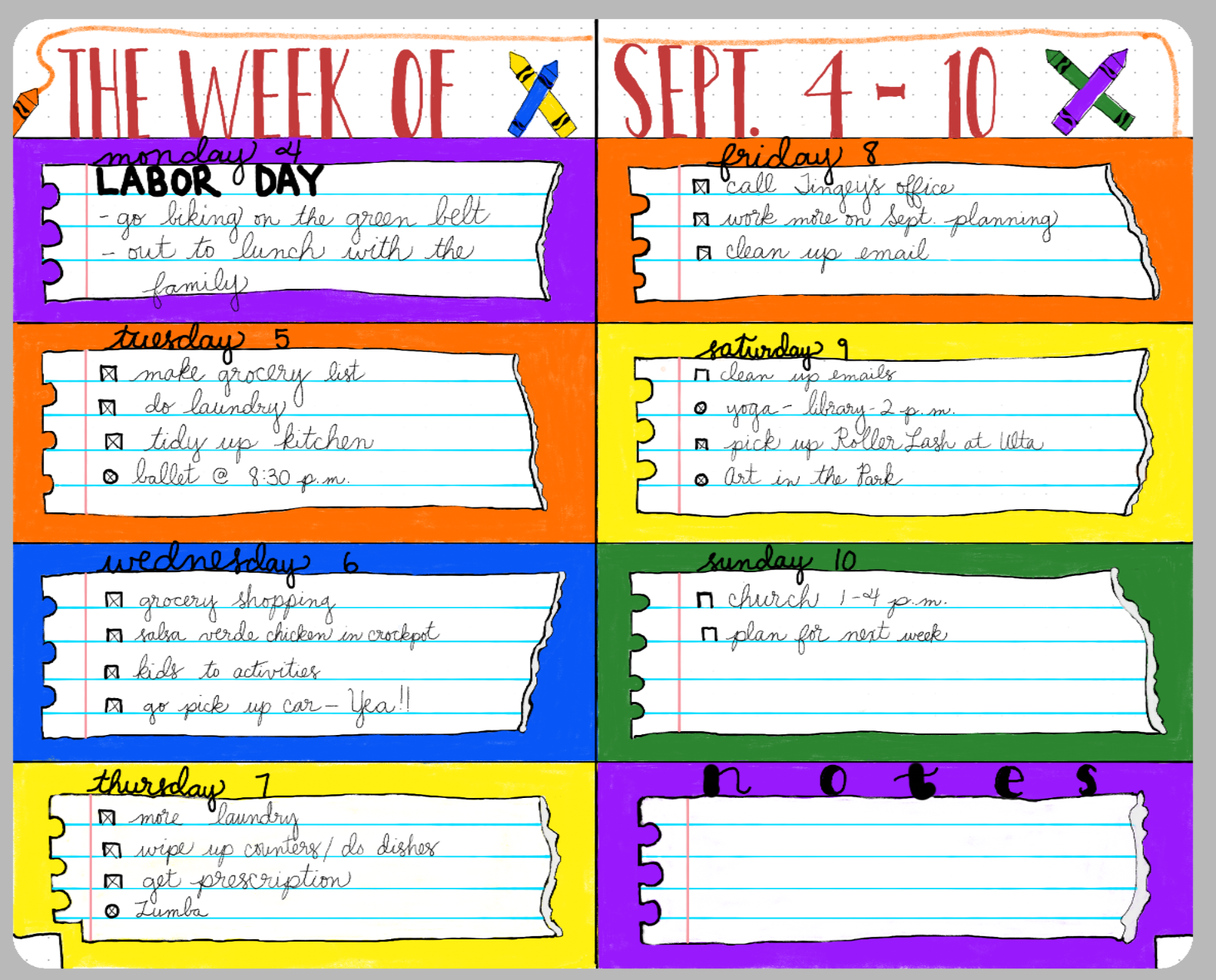
The last spread I wanted to share with you guys is the one I'm the most proud of. I came up with the idea on my own. I decided to make one of my weekly Spreads with a school theme, and for each of the blocks I created for a day of the week, I made it look like a torn piece of spiral notebook paper:

Check out the video I posted to get a better idea of how I created the torn edges:
Also, I said that I would write down the colors I used from each palette in the Morpholio App in case you wanted to recreate this yourself:
Purple: from the Engineering color scheme (it's the only purple in that grouping).
Orange: from the Automotive color scheme (in the second row, the second color from the right edge).
Red: find it in the Automotive scheme (in the the first row, just after the darkest black).
Yellow: from the Diagrams scheme (first row, third color from the left).
Blue: find it in the Comic Art scheme(second row, the only blue in that grouping)
White: You'll see it in the first color scheme at the top of the Palettes tool, in the grouping called "Trace." It's the only white there.
Light Blue lines on Notebook paper: this color's in the Engineering scheme. You'll see it on the second row of hues, right after the lime green color.
Black: also from the Trace color scheme.
Faint gray used to create paper tears: The very first color in the Automotive palette.
Alright then, guys! I hope you are enjoying bullet journaling this month, and feel free to contact me with any questions. Let me know what has been working well in your bullet journal this month.
Thanks again for being here!


