We're hearing a lot of words and phrases right now --- many of which were not even around two months ago. Living through a pandemic has necessitated it in some cases, and other new parts of our vocabulary have become buzzwords or trendy on social media. There are certain ones I'm pretty tired of hearing, like "unprecedented times," "social distancing," and "quarantine," to name a few.
There is another one, though, that I feel is a bit incomplete, which says: "Check on your extroverts. They are not OK." Let me start by saying that I am not criticizing anyone who feels this blurb sums it up for them. I'm not an extrovert and cannot speak to what their experiences with the pandemic are. This is a great reminder for those of us who love these high energy,
social folks. We should be keeping in touch with them and see how
they are doing, as having to be social distant will be difficult. As an introvert, however...I think there should be a companion statement which says: "Check on Your Introverts. Not all of them are OK."
Many of your
introvert friends are having difficulties, too. Yes, there are many
who are enjoying the chance to slow down, stay in, catch up on their
Netflix watch list, and tackle projects that work and other facets of
life have prevented them from doing normally. As an introvert
myself, I have taken pleasure in these activities. There have been
days when I enjoyed the slower pace, having everyone in the family
home for dinner, and not having to drive the mom taxi. Honestly,
though, I still miss people and the things we used to do together.
This may sound funny, since it may seem contrary to your idea of an
introvert, so let me clarify.
A few years ago, when
my family was sitting at dinner, my daughter struck up a conversation
about the difference between our personalities and introversion vs.
extroversion. She identifies as an extrovert. She also recognized
that I was an introvert. Her idea of a great time is to be with her
friends as much as possible. She loves to meet new people and would
rather be out doing something than at home. In contrast, I enjoy
being home. I can pop on a movie or a great playlist of my favorite
movie, and be content to do something while it's playing. I can do
housework, some crafting, or cook in the kitchen. I'm also quite
comfortable going to eat at a restaurant or a movie theater by
myself. As we were discussing this, my girl came to the conclusion
that I was anti-social. What I tried to explain was this is not the
case. I'm not anti-social. I just socialize in a much different way
than an extrovert.
Does this mean I don't like going out with other people?  No, it doesn't.  Am I against
 meeting new people?  No, I'm not.  I still like to grab lunch with some gals from church,
see a movie with my family, and love extended family gatherings.  And, I take fitness
and ballet classes, where you will find me in the front row every single time if I can
manage it.  I might often be content to take a back seat in a group conversation, but
when I dance, I like to be up front, in the thick of it all.
When I go to fitness
classes, I get there several minutes before the class starts to just
sit and gather my thoughts. I can take that time to shed off any
negative thinking, let go of things that happened during my day that
I didn't like, or just have some peace. When I'm home with my
family, I speak a lot. Answering questions regarding dinner, what
needs to get done at home, and so on. I'm also giving constant
reminders: get back to doing homework, please clean up after
yourself, comb your hair, etc. Some days, I feel like a chatty
parrot repeating the same stuff over and over. So, if I have a few
minutes to myself before class starts, and I can relax and enjoy the
silence, I relish that.
If, however, one of
the peeps I know from class sits down and wants to chat, I can do
that, too. Or, I can choose to listen as they talk amongst
themselves and silently enjoy what is being said. There are times I
enjoy just being a listening ear for someone else.
So, after that long
ramble, what is my point? Many introverts are not anti-social. We still
need people...but the way we approach it looks different than it does
for extroverts. I miss going to my weekly ballet class and taking
time to chat with the other students and our teacher. We all
appreciate the adult interaction, as it is often the only
conversations we get that don't involve managing family decisions,
kids, work, etc. I feel great talking and letting each of us have our say.
I also miss going to
events. Last July, I danced in a Flash Mob with a boatload of other
Shine Dance Fitness students. There were some who know me who were
surprised to see me in a bright yellow dress, dancing in the front
row. It was real thrill for me to take part! Dance is one of my
best outlets for self expression. I grabbed a selfie with one of
the instructors afterwards, and went to dinner with a couple of my
brothers and their spouses. This doesn't sound like an introvert's
idea of a fun evening, but for me, it was awesome.
Additionally, three
years in a row, I attended Brave Girl Symposium, which I went to by
myself. The purpose of this event to is to find tools to heal,
bravely live your best life, and connect with other like minded gals.
I didn't go with any girlfriends in tow, but I saw friends I made at
other Brave Girls events, and made some new friends, too. I danced,
swam, ate, cried with, sang, practiced yoga, and attended classes
with these gals. I asked to sit with groups of other ladies when
going to the large meetings. I stayed up late to do some of the
activities with all the attendees, and at other times, ducked out early to decompress
after emotional speeches, or just to wind down and watch TV before
bed (In case you are interested, I did a series of three videos where I show how to make the layout about the flash mob. You can check them out here:)
-I wish I could hug my
mom. While I still see her weekly, since I try to be available to
help her once a week, we don't give hugs because of the pandemic. I
don't see my brothers because of social distancing guidelines. It
bums me out.
-Not being able to do
the normal things with other people is difficult. Unlike some of my
extroverted friends and family, I'm not the life of the party, I've
never been one to entertain at my house a ton, and may not make new
friends every week. However, I still need people. I still miss my
people. I really dislike the social distancing. I hate not being
able to travel, or stopping to chat with a friend or acquaintance I see in the grocery store.
I know I'm not going to die. I realize the pandemic isn't lasting forever. It's just not always fun for me, either. I'm mostly doing OK. But often, stuff gets to me, as I'm sure there's stuff that gets to everyone else.
Take it from an
introvert. We're not all okay, either. So check on your introvert
friends, too, and see how they are doing. See if they want to talk, text with you, or do a FaceTime chat. I think in general, it's wise to check on your friends and family, whether we are an introvert, extrovert, or ambivert, we all still
need connection.
When I first started scrapbooking, I was lucky enough to land a job at a scrapbooking store. I was still a traditional paper scrapper at that time, and loved being in the store around all those goodies. I would find myself stumped, though, when a customer would come in the store in search of supplies for boyish or "manly" supplies. There were a few things here and there, but it was mostly cub scout papers, boys will be boys themed supplies, so on. Making layouts with a masculine touch wasn't easy.
Since that time, though, I've learned a lot about making pages for boys and men. In my own little family, me and my daughter are the sole females and we are outnumbered by my husband and three boys. It's not as hard as you might think, and you'll be surprised at how many supplies in your stash will lend themselves to masculine layouts.
Today, I'll share handy ideas to make your pages about men and boys top notch, even if you don't have what most might consider to typical masculine papers and supplies.
Here's the companion video to go along with this post, if you'd prefer to watch instead of read:
Here is one example of a boyish kit I found. It's the Everyday Boy Kit by Kim Jensen. This is a great one to pick up if you want one that is strictly for boys. It's flexible enough that it could be used for a variety of layouts and boys and men.
Here's the thing, though --- don't get trapped into thinking that other kits in your stash cannot be used for masculine layouts. Just about any kit can be worked around to be used on layouts about boys and men.
Tip #1: Search your Scrapbooking Stash for Items That Are Masculine.
Here's a list of items that I think lend themselves well to masculine layouts, and as long as the color scheme works with your masculine layout, you should be good to go. For that matter, a lot of colors, with the exception of pink, can be used for these types of pages.
-chevron patterns
-diamonds
-argyle patterns
-stripes
-rope & twine
-paint/splatters
-clips, photo turns, & staples
-tags
-arrows
-paper tears & rips
-pinked edges & borders
-washi tapes
-stars
-neutral buttons and stitches (especially ones with ragged stitching)
And really, any paper embellishment, or other item you deem would work with the layout you have in mind. This list isn't all inclusive by any means.
So now that you have a general idea of what to use, here are some pages where I used a kit that's not blatantly boyish, or just used items for random kits here an there. I'll show you how I made these items work.
Also, please note that I will link any of the kits that are still available for sale, so you can go and purchase the kits for yourself if you wish. Unfortunately, if you don't find a kit linked, it means it's no longer available for purchase...sorry about that!
Layout title: This Boy
Boyish items used here: the color scheme, word art "this," which has an arrow, as well as the arrow in the center of the page, both elements with arrows have a graph paper print, and the American Typewriter font which I colored yellow. The border along the outside is a doodled stripe one, and using a rounded rectangle border around the focal picture also helps keep this boyish.
Layout Title: Go Tony Go
What I did to keep this masculine: Yellow, teal, gray, white and black color scheme. Star embellishments on the top of the journaling box. Letter set that came with this kit is black with diagonal stripes. Created a mask with a jagged edge to get the look of torn paper.
Boyish Touches: the little boy stick figures along the bottom of the page with thick, dark stitched arrows, the chunky stitched shapes around the title and journaling, letters with a handdrawn, simple look for the word "boy," typewriter font for title and journaling, chevron and graph patterned paper, as well as the stars from the everyday boy kit. Another interesting thing to note is that this kit was designed with capturing children at play, not necessarily gymnastics, but it lent itself well to this page.
Layout Title: Your Mantra
How I kept this masculine: If you look at that little label in the middle of the photos, you might wonder why I used that, since it has flowers on it. Well, this is one example of how something that looks pretty feminine can work on a layout about guys. "Life is Good" is something my husband says nearly everyday. I thought of him when I saw that element, but I also didn't want this to scream "girl page" when people looked at this layout. So to keep this masculine, I used the yellow, teal, white and brown to keep it from being feminine. I created paper tear along the edge of the striped paper, used strong lines around the photo and kept the page design clean and simple. Sometimes, making the design too embellished and crazy can diminish the masculinity.
So what about this page about my toddler boy? How did I make this without it looking too grown up or too girly? Well, I used the soft color scheme from this kit, which is neither overly girly or boyish to make this work. I also chose an argyle print as the main paper, and worked in a bit of plaid on the outside --- and since both patterns are boyish, it works out well. You may have noticed that I used a flower over the washi tape clusters, but this works here because the tapes have patterns that are boys and the flower keeps it soft and sweet, which I wanted for these photos of my baby. The lettering set kit I thought was very cute and worked well for a little boy.
Layout Title: Tri Again
Masculine touches: Since I didn't have a digital kit about triathlons, I used these papers, which were just a general sports theme, and added an arrow shape from Photoshop as a clipping mask. The patterned paper is covered with stars, the use of black labels and a grungy font really helped make this page.
Tip #2: Use the Events/Activities/Subjects of Your Photos to Drive Page Design.
This may seem like a basic idea, but using your photos as inspiration for very often gives the best ideas for making an amazing page.
Layout Title: Go Speed Racer
This layout of one of my boys in his Halloween costume is one of my favorites. Yes, I could easily have made it look more like this one, called "Eek! Who ARe You?" I could've made it more Halloween themed with lots of orange, black and spooky embellishments:
However, my boy had on a really cute costume, and I felt more inspired to focus on the race car driver vibe. So I found this cute digital kit about cars and traffic, and used it instead. I also used a brush that looked like tire tread and placed that along the side of the page. It was a lot more fun for me to go this route than pumpkins. spider webs, and such, although I've used those for other pages. This is one of my favorite pages of my son.
Layout Title: Boys and Sticks
When I sat down to make this page, I really wanted to capture the fun of what was going on. We took a trip to the mountains with my parents, and my two older boys couldn't resist stopping every few seconds to pick up or examine rocks, bugs, sticks and the like. I wanted to capture their sense of wonder when they were out in the woods. The whole page is based around being outdoors and I let that theme ride for this layout. I think it fit perfectly.
Layout Title: Pinewood Derby
This may have been one of the easiest ones to scrap, since the page is all about cub scouts. You can still see how I made this fit the bill by using a wood patterned paper as a border, the lettering at the top, and the navy patterned paper. The photos definitely drove the page design.
Layout Title: Going To School
This was my little guy's first day of school during his kindergarten year. Yes, this is another layout where choosing the papers and embellishments was a no brainer. The really nice thing about scrapbooking kits geared towards school is that they generally gender neutral. I did use the diamond patterned paper and the colors of the solid paper and embellishments to push this more towards the boyish side, but you can see that it wasn't something I had to wrack my brain over. Having a cute school kit on hand really made this page easy and fun to put together.
Layout Title: Darth Maul Pumpkin
You gotta love Star Wars. When this boy of mine was in 4th grade, his teacher assigned him a pumpkin book report. There was a small written portion, but the teacher wanted each student to do up a pumpkin personifying the main character of his book. My son read a book about Darth Maul, so he made his pumpkin look like that character. It turned out pretty cool, so I was lucky to find a Star Wars themed kit to use for this page. Yes, I could've used a school theme for this page, but the Star Wars theme was much more fitting.
Layout Title: A Boy & His Bug
I really wanted the photos to take center stage on this layout, because they were super cute and showed how enthusiastic my boy was here. I kept the page design simple, plopped them in the middle of the page, and used minimal, boyish colors and just a few "buggy" embellishments to tell th story of this layout. I love this one!
Layout Title: Not Fair
While I could've used typical papers and embellishments about weight loss and health for this page, that didn't suit me. I was also trying to put in some humor to this page about the fact that he can lose weight faster than most people I know, and that by and large, it's easy for him to lose weight if puts very little effort into it. So I went for a large, painty brush, a cool font, and wanted most of the focus on the journaling and photos.
As you've seen on the layouts I previously posted here, fonts can really make your scrapbook page. They are one of secret weapons for setting a theme and look for pages about the dudes in my life. I get most of my fonts from dafont.com, myfonts.com, or fontsquirrel.com
They are great sources for cool fonts you can download for free.
The next several layouts are all examples of how fonts really set the feel and look of a layout:
The fonts on these layouts are some of my favorites to use for page titles, but there are many other great ones you can use. I'm providing you with a list of my favorite fonts for both titles (often called display fonts) and journaling with links if they are available.
Yes, this is a bundle of fonts that will set you back $13, but I think it's worth it. So many fun display and journaling fonts that I are so cool and really aren't replicated anywhere else online. Tangie's "bread & butter" font is one of my all-time favorites for journaling on my layouts. Her fonts are fun and unique!
One last thing: if you want to see more of my boyish/masculine layouts, check out my pinterest board of more scrapbook pages I've made about my husband and boys.
Wow...that was one long post! I hope you found this helpful. Let me know what your go to tricks are for layouts about the guys in your life. Thanks for reading to the end!
Hey guys...summer is winding down here in the US, and it has gone by so quickly! Because my family and I were on the move a lot, I was feeling stressed about keeping up with weekly spreads in my digital BuJo. I'm wondering how the rest of you worked in your journals this summer. Did you keep up with entries everyday or every week? Did you put it on hold altogether? Or, did you choose to keep a simplified version like I did?
One thing that sparked a change in my journaling habits this season was paddle boarding. When my family and I headed up to the mountains for a quick weekend getaway. When we were spending time playing in the lake, I noticed so many people with paddle boards, and was intrigued. One of the guys that came down to the lake with his kids had an inflatable paddle board, and so I asked him a few questions about it. A couple of weeks later, my husband and I found ourselves taking a beginner's class so that I could see what paddle boarding was like. I wasn't sure what to expect, but even though it was a big frustrating at first, I ended up really enjoying myself, as you can see below:
Shortly therafter, my husband and I got inflatable boards, and I spent the last few weeks of August out on a nearby pond enjoying the water on my new board.
So why am I telling you this? Because during this beautiful time of year, being outdoors and active is taking priority over me making a lot of pretty spreads in my digital bullet journal. I still want to document my memories, but weekly spreads aren't cutting it right now. So instead of not doing anything, I settled on a simplified format that still allows me to keep track of appointments and such, but still give me time to get out on the water and enjoy time with my family.
Here's my video to go along with this post, if you'd like to see it:
Before we jump into my summer pages, here's what my May Memories page ended up looking like:
Here's what my journal entries consisted of for each month: I'd include a calendar, and facing it on the opposite page were sections for appointments, birthdays, events, and so on:
Because I was gone at the end of May and the beginning of June, I opted to use some pages from the Everyday Planner kit. This is the same kit I used earlier in the year to do my initial BuJo set up, so I it was an easy choice to use it again during a busy and hectic month. The two page format I used above is what I stuck with for the summer.
There were just a few additional pages I added each month. In June, I did some digital stitch meditations, which are basically drawings of squares where I digital drew or "stitched" embellishments and threads on them. I did some fabric squares when I was at my art retreat, and if you want to see more what the traditional stitch meditations look like, check out the work of Liz Kettle. Stitch meditations are her original idea, and she does them instead of a traditional guided meditation because that works better for her. I love this idea, and have started doing my own fabric meditations here and there, but wanted to see if I liked doing a digital version in my BuJo. It was pretty fun --- I'm not sure if this is something I'll do long term, but I'm trying it out for now.
I'm also doing the the Petite Floral Doodles Class from Erin at the Petite Planner blog. I'm so not finished with the class, but it has been fun so far. This is my first try at the exercises and then I'll be popping pages for this class randomly throughout my journal as I see fit.
And as I generally do, I'm putting in a page of memories for each month in the summer. Here is June's.
For July's spread, I used the calendar I created and offered as a freebie when my YouTube Channel reached 100 subscribers. You can pick that up here. The rest of these pages are hand drawn (please note that in all of my spreads, I've blocked out the birthdays listed here to protect the privacy of my friends and family...so that explains the random red rectangle on the birthdays section below).
The next spread here was created by using a calendar offered by the Petite Planner. If you like here calendar, you can get it by joining her email list, which will grant you access to her VIP Resource Library.
On this spread, the calendar grid and title treatments are Erin's, as well as the sheet with the journaling spaces, banners, and the orange accents at the top. Everything was black and white, except for the word August, so I colored in the elements to match the lettering Erin created. I created the word art and the orange drawings the bottom myself.
The only other page I've done so far for August is this packing list for Brave Girl Symposium, since this will be the only one I'll have time to finish before the summer's over, and I only decided last minute to go that event. It looks a lot like the one I did last year for a similar, trip, but I'm adding in a bit of color since I threw in some of my Bitmojis. When I return from Symposium, the plan is to add some drawings into those two wonky rectangles on the bottom left page.
I hope you guys enjoyed seeing these abbreviated summer pages. I think it's fine to simplify areas of our life when things get busy, and this worked really well for me. I hope you guys that are in the summer season are enjoying the last few days of this lovely time of year. Give me a holler and let me know what you do with your BuJo in the summer. Do you choose to keep going full bore with the same types of pages as you do in fall and winter, or do you simplify? Or maybe you do more? I'd love to hear what works for you.
I'm preparing to go to a mixed media art retreat, Art and Soul Colorado, in just a few days. One of the fun things I'm looking forward to is doing trades...in other words, any participant who's interested makes us a small item to trade with others in between classes. Some make artistic trading cards, small figures, or pins. I wanted to do something a little different, so after doing some research about trades, I opted to make these key chains. Out of necessity, I needed to make something that would be light and not too heavy in my luggage, as well something that wouldn't bog me down as I carried my bag of trades around at the retreat.
I was excited to make these, not only because they'd be different, but because they look so cool. They are pretty easy to make if you have everything you need. Here's a supply list if you'd like to your hand at this. For each keychain, you'll need:
-a cork (can be used as long as it's not damaged)
You can get a bag of several corks from amazon: https://www.amazon.com/gp/product/B003XZ54BO/ref=oh_aui_detailpage_o03_s00?ie=UTF8&psc=1
-lobster keychains (also found on Amazon): https://www.amazon.com/gp/product/B06XGMKM6R/ref=oh_aui_detailpage_o05_s00?ie=UTF8&psc=1
-2 small washers (1/2 in or 12.7 mm)
-2 larger washers (3/8 in or 9.5 mm)
-two head screws (also commonly called eyelets)
-small strips of patterned paper, washi tape, or thin ribbon (use your stash!)
A larger, thicker ribbon to put on the bottom of your keychain (cut into a strip about 1/2 - 3/4 in. wide and about 3-4 inches long)
-E6000 glue (the one with the pointy tip, not pictured)
-a toothpick, if you don't have the glue with the pointy tip
-scissors and pinking shears (not pictured)
You can see my video of the process below:
If you'd prefer a step by step without watching the video, just follow the steps below.
Step One: Gluing on the Washers
Using the E6000 glue, adhere one of the large washers to one end of the cork. Allow to dry overnight to prevent headaches when assembling the rest of your keychain(s).
The next day, glue one of the small washers onto the top of the larger washer. Again, allow it to dry overnight.
I let my corks dry overnight in a cake pan lined with plastic wrap. It was an easy and efficient way to let them dry without the corks and washers slipping all over the place.
When the corks have both washer sets completely dry on one side, repeat the process with the other side.
Step Two: Insert the Eyelets/Headscrews
On one end of your cork, start screwing your eyelet into the cork through the hole on the smallest eyelet (don't put any glue down into the hole just yet!). Tighten the eyelet down until it fits flush with the top of the small eyelet. Carefully pull the eyelet back out of your cork.
Once the eyelet is removed, take a toothpick and cover the bottom half of it with the glue. Push the glued-up pick inside the hole you created with your eyelet, then pull it back out. If you have the glue tube with the pointy tip, you can try pushing a bit of glue into the hole with that. When the adhesive inside the hole, screw the eyelet back down into the hole again until it is tightly up against the small washer.
Repeat this process with the glue and another eyelet on the other end. Your key chain should now look like the one in the photo above. Lay flat and allow to dry overnight, one more time.
Step Three: Add the Key Chain Attachment and Washi and/or Patterned Paper
Choose one end, and put on the key chain. I personally liked using lobster keychains, because they have a hook that's quick and easy to attach, but it's possible to thread the standard circular key chains around the eyelet; it just takes a bit longer.
On the same end as the key chain, wrap washi tape on the cork as close as you can to the large washer. Or, if you prefer, take a small, thin strip of digital or traditional patterned paper with the glue. Washi tape is easier to use, since it's self-adhesive, but it's not hard to glue on paper. You can see my key chain below that has paper instead of washi.
I suggest letting key chains made with paper trim dry for a good, long time. Drying time doesn't necessarily take overnight.
Step Five: Add a Ribbon loop
To add your ribbon loop, take your small length of ribbon and cut the ends with pinking shears (which keeps your ribbon from fraying). Fold your ribbon in half, then thread the loop through the eyelet. Take the loose ends of the ribbon and pull them through the loop through the ribbon. Pull the ends securely through the loop and snug the ribbon up through the eyelet. You can see the ribbon as I've looped it through the head screw in the picture above.
The key chain is finished, and making it is pretty easy!! The most time consuming part is the drying time, but once that is done, the rest of the key chain is quick to assemble.
Here's a small sampling of the a few of the key chains I made. I used plaid ribbons for the bottom of the chains, but any ribbon you prefer could easily be substituted.
Thanks for checking out this project and I hope you'll let me know if you give making the key chains a shot.
Hey guys! How is your month going so far? I'm glad May is here, and I can see some fun things coming my way, as well as some difficult things I will have to work my way through this month.
As Mother's Day approaches, I find myself both thankful for the blessing it is to raise my children, and the sadness for the things that are testing my mettle as a mom and a person. I remind myself that the bad things will pass, hopefully there are enough good things that are going on with my family, and that we will end up better people in the end. If you have a mom in your life, please celebrate and honor her, whether you celebrate Mother's Day or not. She will love you for it.
In the midst of everything I have going on, having a bullet journal to plan things out will help me have the most positive and productive month I can.
If this is your first visit to my blog, welcome! Just an FYI, I use the following for digital bullet journaling:
If you'd like to watch my video on this month's planning, here's the video:
Here are my page spreads for this month. At this point, I have only a few to share. There will be more later on, as I'm taking another BuJo doodling class. I hope you'll check back for more pages as the month goes on.
Weekly page spreads:
I wanted to throw this one in here, showing a better way to use my Bitmoji avatar, since the last one was a bit smaller than I intended. I made the Bitmoji a larger and more prominent in the page design here and like this a lot better. If you wanna see how I created stickers with my Bitmoji, check out last month's post.
On the spread I made for last week, I really wanted to add in a circular shape of some sort, so this is what I tried out. It was a bit of struggle, since I've not figured out a great way to use a standard template that one might use on paper, and Morpholio doesn't have any circle shapes available to use in the app. In any event, I still had fun with it. The flower shapes are from the Boho Berry Tribe Resource Library. Kara, the blogger who offers those resources, has some great stuff that you can use in your digital journals. I highly recommend you check her out.
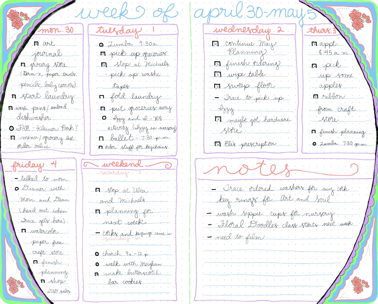
Here is this week's spread...which I tried a little experiment with. Part of it I really like, and part of it I feel like could be better. However, I also realize that not every spread needs to be an award winner, and that my BuJo is a perfect place to try things out and it's not a big deal if things don't work out the way I expected. It was a fun thing for me to use hexagons, and in the future I'll try again and improve on this. The colors are awesome and it was fun trying it out.
For my memories and calendar pages, I decided to limit each of them to one page. April was super busy and I spent time doing a lot of basic things to keep my household running, and had some deadlines to meet. It was much easier to just use one page each for these two items. The memories page is all my work, and I hand drew the calendar grid, lettering and numbers myself. The "May" word art and the two washi tape strips are also from the Boho Berry Resource library. It was so cool working those into my calendar page.
I'm including another packing list, since I'm heading to an art journaling retreat near the end of the month. Can you tell I'm loving my Bitmojis? There isn't a ton on this page right now, but I don't want to fill too much in until I get my list items written down. I'll give you another peek next month when the page is finished.
Ok, guys...that will do it for now. I hope to be back soon with another post. Thanks for being here and letting me share my words and creations with you. Have a nice day!